

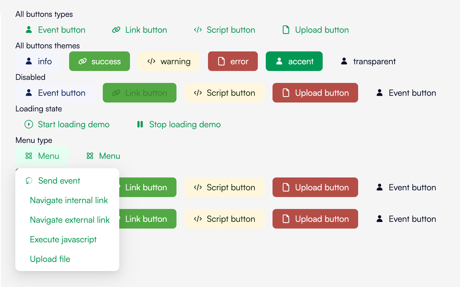
Minimal usage
theme changes the colors of the button.
defaultinfosuccesserrorwarningtransparent
css like any other block to make your very own style.
icon add an icon left to your content. Value can be an url to an image file or a icon name.
Advanced usage
content can ba a string, a localized string, or a blocks list:
type influences on the behavior of the button. Followings types are available:
eventwill emit the event set onvalue.valuecan be just a string or an object witheventandpayload.internalandexternalare just href links and will navigate to the link set onvalue``.valuecan be a single string or an object withhrefandpopup`.scriptexecutes javascript set onvalue.uploadopens a system file picker and emit the event set onvaluewith the file url in payload.valuecan be a single string or an object likevalueofeventtype plus anacceptattribute which allow to restrict the files types the user can select.menudisplays a menu with a list of buttons. itsvalueis an array of another buttons descriptions. A menu can contains another menu and so on.
disabled set the button as disabled. Useless while a callback takes times. Example:
loading replace or add an spinner icon to your button. Example:
confirm will ask a confirmation before trigger the action.
confirm object takes the following attributes:
titleis title of the box displayed to the user. It can be a string or a localized string:labelis the main text displayed to the user. It can be a string or a localized string:yesLabelis the label of the confirm button:noLabelis the label of the cancel button:placementposition the dropdown around the button. Default will adapt automaticall but you can force with:- ‘top’
- ‘left’
- ‘right’
- ‘bottom’
- ‘topLeft’
- ‘topRight’
- ‘bottomLeft’
- ‘bottomRight’
- ‘leftTop’
- ‘leftBottom’
- ‘rightTop’
- ‘rightBottom’
modechanges the way the box is displayed. Default isdropdownwhich display a dropdown around the button.modaldisplays the box over the screen as a dialog box.